Tuesday, April 14, 2020
Propaganda Poster Illustrator
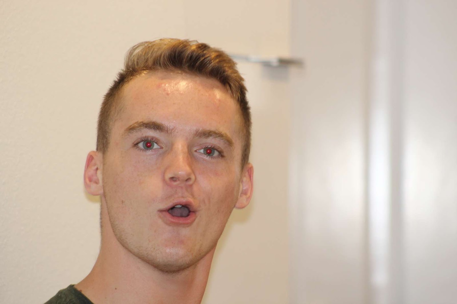
Artist Statement: This is my propaganda poster that I made through Adobe illustrator. I started by uploading a photo into the program and drawing/outlining all the seperate portions of my face in layer order so that everything showed up. I think the hardest portion of this project was the lips because the original photo has a very weird lip formation. I enjoyed adding highlights to the hair to give it more texture as a single layer made it look flat. I struggled to come up with a simple propaganda slogan to suit the photo. I settled on change because I could put my tag brush in there as a letter and its a simple one word slogan. Thanks Obama. For the background I took the rising sun style propaganda and made it blue to go with the highlights on my face. I think of all the programs we have looked at so far illustrator has been the hardest for me but I'm glad I have a better understanding of it now.
Somewhere project
Artist Statement: For the Somewhere project, I liked the idea of putting myself into a movie scene. While I had thousands of options to choose from a lot of the lighting scenarios would have been tough to replicate without lighting equipment. So I settled on this outdoor shot from Ari Aster's Midsommar Horror film. By making this choice I have already given myself a good chance of matching the colors better in Photoshop. When I got working my hardest portion was getting my pen selection curves perfect to make a mask. After moving the selection on to the movie scene, I played with the colors, blur, vibrancy, and saturation of my selection. While I do think this project could be improved. For teaching myself it today I think it looks pretty solid and I am pleased with it. Something I tried to add and think failed a bit with is the shadow of my body, I added a burn shadow to the grass below my body but it seems to be too broad. I think this project helped further my understanding of photoshop as a program and its potential uses.
Sunday, April 5, 2020
BW photo with Tag brush
ARTIST STATEMENT:
For this assignment we were tasked with stripping an image to greyscale in photoshop and then to recolor the image using an Adobe color theme. I liked this project as it took more time than I thought it would, it was a challenge to figure out all the masks and how neat they had to be. I learned from this project more than any other that patience is the key to the game. After many errors I was becoming frustrated but I got back down to the basics and I think as I worked I developed more and more into it. My favorite of the three is the monochromatic as I think that looks the cleanest.
Photoshop Tutorials
Here are three tutorials that helped me a great deal with my assignment:
1.
2.
3.
original
analagous
complimentary
compound
monochromatic
shades
triad
Artist Statement for BW Photoshop project:As this is my first experience in Photoshop, getting comfortable with the program is taking time. I found this project quite pleasant though as in my major I have already taken an editing class on color correction in DaVinci Resolve. It is always fun playing around with the colors because you can completely change the dynamic of an image. From the above images it is clear that the same picture could be many different times of day to more drastic color changes. I also feel like my knowledge of color themes was improved and I will not hesitate to take advantage of the color theme creator. The only issues I encountered during this process was getting comfortable with the program and learning the shortcuts and window names. After a couple of tutorials though it gets easier and easier. I'm looking forward to working more in Adobe Photoshop.
Sunday, February 23, 2020
Elephant Calligram
Artist Statement:
This piece of work was inspired by Calligram designs. Using Adobe illustrator, I outlined and traced an image of an elephant and worked to outline it with text. From there I moved to defining the features of the Elephants body to make it seem as if the words were just another form of line. This project posed a much greater challenge to me, I have never had experience with illustrator so this felt like swimming in the deep end. That being said I think I was able to complete the assignment to the best of my abilities. I always liked Elephants as a child because they were the biggest and most funny looking creatures I had ever seen. This inspiration worked well for this project because the outline of an elephant is very easy to point out and identify. No other creature really looks like them so even if the quality of this elephant is confusing because of the text, it is always recognizable as an elephant. That is what I was going for.
Tuesday, February 11, 2020
Canvas
Artist Statement:
This piece of work was inspired by cubism, a very interesting artistic style. I found a painting of a tree blowing in the wind, the beach air curling through the leaves. I loved the peacefulness of the tree, like it had been there for many years, accustomed to the harsh wind and sea air. I was reminded of ancient trees with spiritual purpose, that stood high in the mountains. The sacred type that has a aura of peace around it. While the image that inspired me was a tree on a beach, I wanted to create my own space that would still feel grand but have a modern element to it. The curves and lines in the background feel like pure space, a digital wind blowing through. One that could be very overpowering, yet a tree stands here, bristling in the wind, minding its own business. For the Colors, I picked this Blue and Yellow style because it provides a neat contrast, the highlights of purple adds just enough range to really bring it all together. I really enjoyed working on this and I am proud of the final product. I think the message of this piece is to remain calm and strong in the face of the unknown, just like the tree.
Subscribe to:
Posts (Atom)


